
Let's be real: The 90’s were a terrible time for comics.
After achieving the incredible surge in popularity in the 80’s with works like Frank Miller's The Dark Knight Returns and Alan Moore's Watchmen, it seemed inevitable that the high would come crashing down. Between the fiasco with Hal Jordan and his Emerald Action Team, Rob Leifeld’s artistic abominations that made him one of the most popular comic book artists of the decade, the drowning of the market in variant and limited edition comics in an attempt to boost value and sales, and the overall grudge-saturated anti-hero violence from Image Comics, the decade managed to paint itself with one hell of a nasty brush. I can’t look at most 90’s comics without getting a headache.
But out of all the muck and mire that swirled around in that cesspool, there were bright spots. Comic book artists, after the split of many of the industry’s most popular that led to the creation of Image Comics, began to gain more creative control over their work. Tim Drake, regarded as the best Robin by many fans, got a solid ten-year-plus tenure and his own comic (yes, I consider this a bright spot) after Jason Todd was...removed from the role.
And of course, 1992 introduced the world to Batman: The Animated Series.
Often ranked one of the greatest animated series of all time by various news outlets (second, in many cases, only to The Simpsons), the show has been praised for its adult tone, clever and intelligent writing, voice acting, and impressive design work. The impact of the show’s story lines and characters have been seen in everything from films to other television shows to even the comics themselves. For many people, this version of Batman is the definitive. The sound of Kevin Conroy as Batman and Mark Hamill as the Joker still plays in their head whenever they read the comics. The show continues to be loved and cherished by the fans that grew up with it and even newcomers that are looking for something good to sink their teeth into.
I was not one of the lucky souls to be able to experience this show first-hand. By the time I was old enough to comprehend any kind of television other than Sesame Street and The Muppets, it was closer to the 2000’s and I only caught glimpses of the show on Cartoon Network before changing the channel to Spongebob or Rugrats because apparently I was a very shallow child. That being said, I consider myself the ideal candidate to look at this show objectively. I have no nostalgia attached to it and up until this past spring I couldn’t have cared less about how great everyone made it out to be. So with my unabashed love of superheroes and comics now flying through my veins like a potent virus, I spent the last four months--FOUR MONTHS--tackling this show from episode one.
I would love to do an in-depth look at this show, but given the sheer size of it and the fact that this post is already massive, I can only start with a general overview. Maybe one day I will take on a more narrowed and focused review, but this is as detailed as I can get at the moment. Sigh.
 |
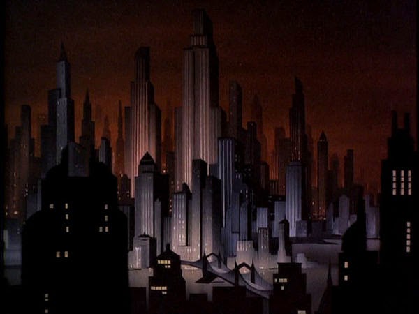
And what a beautiful and striking creation it is. The look and feel of Gotham City is pitch-perfect. It’s dark, foreboding, and innocent at the same time. It strikes a similar tone as the first few Batman comics of the late 30’s and 40’s which were heavily influenced by noir yet still maintained a sense of early 20th century American simplicity. I love the noir-influenced title cards and period-esque music that often accompanies them. When you make something that doesn’t attach itself to any particular decade or time period, they are more likely to age well. Fairytales are a great example: they may have elements that link them to the past, but their stories, characters, and settings are vague enough that they could be anyone or anywhere. BTAS has this in its favor; while there are moments of awkward dated references (like the ancient proto-computers in the Batcave that are kind of hilarious to see now), there is almost nothing that solidifies it in a particular time period.
In terms of character designs, I’m...not a fan. Even before I saw an episode of the show, I knew what Timm went for in all of his drawings thanks to my experience with Justice League. Call me whatever you want--a traitor, a loon, not a real Batman fan--but I never cared for Timm’s angular, box-like designs for all of his male characters. For the first half of the series Bruce is so overwhelmed with CHIN CHIN CHIN that it distracts me from the rest of his face and body. It’s especially noticeable when he is just Bruce Wayne and not Batman since I don’t have the rest of his costume to draw my attention away from the the big, square chin and massive over-stylized shoulders (which are are tame in comparison to the shoulders in Justice League). His face does get a little better as the series progresses, with more detailed lines and a greater range of facial expressions, but from the start I found the art to lean more towards practical than stylized (which would make sense for moderately-budgeted animated show, but still). Also, none of the men have knees. That bothers me.

The females bother me only in the sense that I feel as though most of them look cut from the same cloth; switching Ivy’s hair with Selina’s wouldn’t be that jarring of a change. Harley’s look has a bit more personality, but the general body shape is the same, simplistic curved design that I suppose juxtaposes well with the boxiness of the men, but doesn’t allot for much variety. I understand that having a set formula for the characters allows for easier and smoother animation, but it couldn’t hurt to offer something different for all of the female protagonists.

Speaking of animation, that’s one area that, in many respects, doesn’t age well. Don’t get me wrong--later episodes are often fluid and consistent, but the first chunk of them have various moments where the artists may have been trying to “get into their groove” so to speak and the fluidity is affected. Animation in the first half of the series ranges from pretty good to down-right terrible, most noticeable in the women whom the animators appear to have had a difficult time capturing consistently. Characters’ faces and bodies tend to have a limited number of poses and not much in-between animation that gives that illusion of full, coherent motion, so they move in strange and simplistic ways.
 Despite some of the pitfalls in quality, Batman himself manages to stay consistently well-done and is the most fun to watch (aside from the Joker), which I suppose is the whole point. I love how expressive the eyes in his mask are, how they have an almost glowing appearance against the black of the cowl. They narrow, they widen, they fluctuate as much as the rest of his body. The cape is my favorite element of his design; it doesn’t always move with his body like a real cape would, but it does have plenty of dexterity and the sound effect they give it works great--it’s like a curtain being pulled over his face or wrapped around his torso. He can be drawn in silhouette, full detail, or a cape with a face. All of this variety speaks to the essence of this Bruce Wayne: he truly comes alive when he is Batman.
Where I think this show really shines, though, isn’t so much in the animation or art style--it’s in the characters. My initial reaction to Bruce Wayne/Batman was that, believe it or not, he was on the boring side. He didn’t talk much and felt so different from Nolan’s take or Miller’s. The intensity of those interpretations, I think, made the toned-down anger and vengeance displayed in the cartoon come across as dullness. But after a few episodes the character began to unravel a bit. One of the things that I can’t praise Timm and Radomksi enough for is the fact that they made Bruce/Batman likeable. I hate it when writers take Batman and turn him into an angry machine that just likes to beat the crap out of people (*cough* Miller *cough*) because I think that does a huge disservice to the character’s potential. Here, he is a genuine human being with a wide range of emotions. He tends to be more open to jokes or snide remarks when Robin is around, but even running solo, the dark and brooding aspect of his character doesn’t smother him like other interpretations. He smiles, banters with Alfred, and has compassion for everyone--even his enemies. This Batman would rather see the people he sends to Arkham regain their sanity and go on to live normal lives than be stuck in prison until the die. Even as Bruce Wayne, his playboy rich guy status is portrayed as more “nice, ignorant white dude with good intentions and too much money.” He isn’t cocky or arrogant or annoyingly elitist. His drive, his intensity is all there but it’s kept subdued thanks to the great voice work of Kevin Conroy. Conroy does a fantastic job of balancing the intense and powerful with the kind and compassionate.
.jpg) Robin isn’t as nuanced as Bruce Wayne/Batman but he has his own level of characterization that makes him a solid presence. Unlike the comics, this Robin/Dick Grayson has been made older and more serious to fit in with the tone of the show, but he’s still very much a kid, especially in comparison to Batman. He doesn’t get as much screen time as I would have preferred, but I can respect that when he does show up, they don’t make him cannon fodder. He does have some goofy, charming moments and isn’t as one-track-minded as Batman. I like how when he’s Robin they tousle his hair and then comb it back when he is just Dick. I’m not crazy about the voice actor, as I feel like he tends to accentuate the dork instead of the charm in Dick’s character (and not in an endearing way), and there’s something...nasally about it that irks me. They updated the Robin costume to what Tim Drake’s was in the 90’s, eliminating the chainmail shorts and pixie boots in favor of green tights (or leggings...or whatever they’re supposed to be) and more practical footwear. While I will always have a soft spot for that dumb-ass, impractical costume of the Golden Age, this one works well in the context of both a modern interpretation and the tone of the show. Even though it’s, you know, red and green.
Robin isn’t as nuanced as Bruce Wayne/Batman but he has his own level of characterization that makes him a solid presence. Unlike the comics, this Robin/Dick Grayson has been made older and more serious to fit in with the tone of the show, but he’s still very much a kid, especially in comparison to Batman. He doesn’t get as much screen time as I would have preferred, but I can respect that when he does show up, they don’t make him cannon fodder. He does have some goofy, charming moments and isn’t as one-track-minded as Batman. I like how when he’s Robin they tousle his hair and then comb it back when he is just Dick. I’m not crazy about the voice actor, as I feel like he tends to accentuate the dork instead of the charm in Dick’s character (and not in an endearing way), and there’s something...nasally about it that irks me. They updated the Robin costume to what Tim Drake’s was in the 90’s, eliminating the chainmail shorts and pixie boots in favor of green tights (or leggings...or whatever they’re supposed to be) and more practical footwear. While I will always have a soft spot for that dumb-ass, impractical costume of the Golden Age, this one works well in the context of both a modern interpretation and the tone of the show. Even though it’s, you know, red and green.I love the way they write Alfred. He’s snide, clever, and doesn’t take things too seriously, even though he’s a hard worker. He’s devoted to Bruce and more or less accepts his nighttime escapades, making sure that the house and bills and cooking is taken care of and still finding time to say something sarcastic to Bruce. I think I laughed more at the things he said than anything else in the show.
 Mark Hamill’s Joker, of course, is everything I expected it to be. I have to give props to the voice direction here, as I believe that a lot of the spectacular voice acting can be attributed to the fact that a) they all performed their lines in the same room with each other, a rare occurrence at the time for animated television shows and b) someone had to see Mark Hamill’s audition and say “Yes--THAT is the person we want to play the Joker.” I mean think about it: If the guy whose most famous previous role was of the nice-guy Luke Skywalker walked in and auditioned for a psychotic, irredeemable monster (with a dark sense of humor), would YOU cast him?
Anyway, Hamill’s performance here, as well as the writing and animation, are all consistently excellent. I can understand why many people feel he’s the best representation of the character, even after Ledger’s role in The Dark Knight. As for me, I’m a bit torn. I love the fact that this Joker is in constant flux and never settles on one mood or personality from episode to episode, but I also think I may prefer the versions that aren’t limited by censorship because they’re meant for kids. You know, the ones where he’s a sadistic, psychopathic killer without any scruples and a heck of a lot of intelligence.
Hey, as I mentioned before, I’m a sick and twisted individual.
But aside from personal preference, there’s absolutely nothing wrong with this take. Every moment he’s on screen is a joy to watch because he somehow manages to breathe life into his scenes despite wanting to do nothing but destroy.
As for Harley...I was rather excited to see her for the first time. I knew that she originated on the show and was one of the first (if not THE first) characters to be admitted into the comics from another medium. Her design is fabulous--I love how her jester ears act as her hair or an extension of ears depending on her mood--and the dichotomy they set up between her and the Joker is certainly interesting. The episodes she’s in are always fun and she’s a creative concept for a sidekick without making the two of them Batman and Robin Gone Bad. While her voice does tend to grate on me, I find her endearing more often than not.
I do have some issues with her, but that is another article in and of itself and I don’t have the time or space to cover it here.
 |
| And it's not because of her overt sexualization. |
I would say that Batman: The Animated Series’ notoriety is well-deserved. It’s an intelligent piece of work from many talented individuals. It’s not something that is impossible to top (I believe some shows have come close), but it’s one that will be remembered fondly by millions and respected by others, including myself.
No comments:
Post a Comment